
This is a demonstration of using descriptive statistics (using graphs and numerical summaries) to make sense of a one-variable data set (the seasonal rainfall data in Los Angeles). The techniques we use are frequency distribution, histogram, and various numerical summaries. The focus here is not the technical how-to for constructing the graphs and the calculation of the numerical summaries. The focus is on the narrative on using these techniques to make sense of the data. If there is any question about any of the techniques, see [1] or your favorite introductory statistics textbook (or Google). The histograms and the calculation are done in an Excel spreadsheet. At the end of the post, a data set for rainfall in Everett, Washington will be given as exercise.
Rainfall Data in Los Angeles
The following is a table containing the seasonal rainfall data (in inches) in Los Angeles from 1877 to 2009, recorded at the Los Angeles Civic Center. The data are obtained from the Los Angeles Almanac. The rain seasons are on a fiscal year basis (July 1 to June 30). Thus the season 2008-2009 refers to the period July 1, 2008 to June 30, 2009.

We are interested in analyzing the seasonal rainfall measurements (in inches). With only 3.21 inches of rain, the season 2006-2007 was a drought season (in fact, the dryest season in the the 132-year period represented in the data). But the season just a couple of years earlier (2004-2005) was the second wettest season in the same 132-year period. So we see that there is a great deal of variability in the Los Angeles rainfall data from season to season and from year to year. However, the raw data provide little information other than simple observations such as the one we just make. We need ways of converting the raw data into useful information. The main ways of summarizing a data set are through looking at graphs and using numerical summaries. Such methodologies are grouped under a statistical approach called descriptive statistics.
The graph we use to summarize the LA rainfall data here is a histogram. Before we summarize the data, it will be helpful to order the data from smallest to the largest. The following shows the Los Angeles rainfall data sorted in ascending order (displayed from left to right and top to bottom). The sorted data will be useful in constructing the frequency distribution.

______________________________________________________________
Frequency Distributions and Histograms
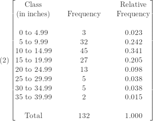
The first step in constructing a histogram is to organize the data into a frequency distribution, i.e., to break the range of the data into classes (or intervals) and count how many data elements are in each class. For example, the Los Angeles rainfall data range from 3.21 inches to 38.18 inches. So we can break this range into 0 to 4.99 inches, 5 to 9.99 inches, 10 to 14.99 inches and progressing all the way to 35 to 39.99 inches. We then do a tally and obtain a frequency distribution. For example, three rain seasons belong to the class 0 to 4.99. The rainfall data for the next thirty two seasons are between 5 inches and 9.99 inches, and so on. The following shows the resulting frequency distribution.

We can also add the relative frequency distribution alongside the frequency distribution. To obtain the relative frequency, we simply divide each frequency by the total count (i.e. expressing the count in each class as a percent or proportion of the total).
To further help see the overall pattern of the data, we construct two histograms, one based on the frequency distribution in 


The frequency distribution and the histograms provide considerably more information than the raw data alone. The frequency distribution tells us how often or how likely a data value will occur. For example, extreme rainfall seasons are rare. If defining a drought as seasonal rainfall being less than 5 inches, it only happened three times out of the last 132 seasons (according to the frequency distribution) and happened 2.3% of the time (according to the relative frequency distribution). For extreme rainfall on the other end (say, more than 35 inches in a season), it happened 2 times in the last 132 seasons or happened 1.5% of the time.
More importantly, the relative frequency distribution in
The frequency distribution and the histograms can also inform us the shape of the data distribution. The fact that the lower classes containing most of the data values is an indication that the data distribution of the LA rainfall data is a skewed distribution and not a symmetric distribution. We can also see this in the histogram. Note that the tail to the right of the peak is longer than the tail to the left of the peak.
______________________________________________________________
Describing the Overall Pattern of the Data
With the histograms, we can describe the overall pattern of the data and identify any striking deviations from the overall pattern (if any). For the LA rainfall data, we describe the overall pattern by noting the shape, the center and the spread of the data distribution. The striking deviation refers to the outliers (these are individual data values that fall outside of the overall pattern).
The Shape. As indicated above, the LA rainfall is a skewed distribution since one of the tails is longer than the other. Because the tail to the right of the peak is longer than the tail to the left of the peak, the LA rainfall data have a skewed right distribution.
The Center. The center refers to the “average” of the distribution. There are more than one notion of average. For now, we focus on the median (the middle data value when the data are sorted). The median in this case is in between the 66th data value (13.07 inches) and 67th data value (13.13 inches). These are the two middle values of the data and the median is the middle of these two values, which is 13.1 inches. More about the measures of center will follow in the next section.
The Spread. The spread refers to the numerical summaries that indicate the degree of variability or dispersion, indicating how spread out the data are. For now, we use the range, which is the difference between the lowest data value and the highest data value. Taking the difference between the maximum and the minimum produces 34.97 (=38.18-3.21). The range of 34.97 tells us that all the data values varies within an interval of length 34.97 inches. Of course, the wider the range, the larger the degree of dispersion. The range is actually a very crude measure of spread. A more in depth discussion will follow in the next section.
The Outliers. An outlier is a data point that falls outside the overall pattern (graphically as indicated by the histogram or the frequency distribution). There does not seem to be any data values that stand apart from the overall distribution. We conclude that there is no outlier in the LA rainfall data. There is a rule (called the 1.5 X IQR rule) for identifying outliers that does not depend solely on visual inspection of graphs. However this rule is only a guideline. See [1] or your favorite statistics textbook for more information about the 1.5 X IQR rule.
Comments about the Shape of Distribution
Locate the median on the horizontal axis in the histogram. In the above histogram, the median is at the third bar. The side to the right of the median is called the right tail and the side to the left of the median is called the left tail. When one tail is substantially longer than the other (one tail extends much further out than the other tail), the distribution is skewed. When the right tail is the tail that extends out, the distribution is said to be a skewed right distribution (as in the case for the LA rainfall data). See the figure below.

When the left tail is the tail that extends out, it is said to be a skewed left distribution. On the other hand, when the left tail and the right tail are approximately mirror images of each other, the distribution is said to be symmetric.
Data for skewed distributions cluster at either the low end (the left side) or the high end (the right side) of the horizontal axis. A good basic example of a skewed right distribution to keep in mind is that of a difficult exam where most students perform poorly (most of the scores are in the lower classes and the first few bars in the histogram are very tall) while a handful of students perform very well. A good example for a skewed left distribution to keep in mind is that of an easy exam where the vast majority of the students have high scores (the last few bars in the histogram are very tall) while a small handful of the students do poorly.
______________________________________________________________
Using Numerical Summaries to Describe the Data
There are two types of numerical measures to describe the distribution of LA rainfall data, namely the measures of center and the measures of spread. A measure of center is a numerical summary that attempts to describe what a typical data value might look like. A measure of spread is a numerical summary that describes how spread out the data are.
For the LA rainfall data, we consider the following numerical summaries:

Center
The first two numerical summaries in 
The mean is the arithmetic average, obtained by adding up the data values and devided by the total count. The median is the midpoint of a distribution. When the data values are sorted in ascending order (from smallest to highest), the median is the middle data value. Thus the median is the data value separating the lower 50% and the upper 50% of the data. If the number of data elements is an odd integer, the median is exactly the middle data value in the sorted data. If the number of data elements is an even integer, the median is the average of the middle two data values in the sorted data.
For example, there are 132 data points in the LA rainfall data. The middle two data values are the 66th data value (13.07 inches) and the 67th data value (13.13 inches). Thus the median is the average of these two data values (13.1 inches). Thus half of the rain seasons in LA are lower than 13.1 inches and the other half are higher than 13.1 inches.
Spread
The last four numerical summaries in
Spread – the Range
The range, is defined as the difference between the maximum and the minimum in the data and is a crude measure of spread (see the figure below). It is not a reliable measure (since it can be subject to distortion by outliers) and will not be discussed further.

Spread – Standard Deviation
The standard deviation shows how much variation or dispersion there is from the mean (see the figure below). Thus the calculation of the standard deviation involves the mean. A low standard deviation means that the data points tend to be very close to the mean, whereas high standard deviation means that the data points deviate greatly from the mean (i.e. spread out over a large range of values).

Spread – 5-Number Summary
The 5-number summary of a data distribution consists of the smallest data value (Min), the first quartile (Q1), the median (Med), the third quartile (Q3), and the largest data value (Max). The first quartile is the data value separating the lower 25% of the data and the upper 75% of the data. Alternately, the first quartile is the median of the data values below the median. The third quartile is the data value separating the lower 75% of the data and the upper 25% of the data. Alternately, the third quartile is the median of the data values above the median.

Spread – IQR
The inter-quartile range (IQR) is related to the 5-number summary. The IQR is defined as the difference between the third quartile and the first quartile (Q3-Q1). The IQR is the length of the interval containing the middle 50% of the data (see the figure below). Note that 25% of the data are below Q1 and 25% of the data are above Q3, meaning the remaining 50% of the data are between Q1 and Q3. Thus IQR can be regarded as a measure of spread. The higher the IQR, the middle 50% of the data are more widely dispersed around the median. The smaller the IQR, the middle 50% of the data are more closely clustering around the median. Since the IQR is derived from the 5-number summary, we also consider the 5-number summary as a measure of spread. The two measures are essentially one and the same when they are considered as measures of spread. We usually just give one.

The mean is an arithmetical measure (summing the data and divided by the total). The median is the middle value of the data and is thus a measure of position (obtained by ranking the data). Thus the mean is obtained by arithmetic and the median is obtained by ranking the data. Since the standard deviation is calculated using the mean, the standard deviation is also an arithmetically based numerical summary. On the other hand, the median, 5-number summary and the IQR are measures of position (obtained by ranking the data). Thus the mean and the standard deviation are used together. On the other hand, the median and the IQR are used together. Which set should we use to describe the LA rainfall data? The answer to this question depends on the shape of the data distribution.
For any reasonably symmetric distribution that has no outliers, mean and standard deviation are better measures of center and spread, respectively. For skewed distributions, we should not use mean and standard deviations and should use measures such as median and IQR (or 5-number summary). For a skewed distribution, the median is a more reliable indication of what a typical data value look like. This is because the median is less likely to be affected by extreme data values. Because the median and the IQR are measures of position, they are more likely to be able to resist the influence of extreme data values (thus they are called resistant measures). For a more in depth discussion of resistant measures, see this post.
For the LA rainfall data, the preferred numerical summaries are: center = 13.1 inces (median) and spread = 9.68 inches (IQR). See the figure below.

Relating the Shape of the Distribution to Numerical Summaries
Can we determine the shape of the distribution just from using numerical summaries? Whenever possible, we should always start with a graph. However, numerical summaries tell a story all by themselves. We now look to the numerical summaries to find indication of the shape of the distribution.
For example, if the mean and median are far apart, the distribution is likely skewed. In the LA rainfall data, the mean is 14.98 inches and the median is 13.1 inches (the difference of almost 2 inches). See the figure below. This comparison tells us that this is a skewed distribution. The fact that the mean is much greater than the median makes this a skewed right distribution. This is because the extreme data values in the longer right tail pull up the mean. Thus whenever, the mean is significantly greater than the median, it is a skewed right distribution. On the other hand, whenever the mean is significantly lower than the median, it is a skewed left distribution. When the mean approximately equals the median, it is a symmetric distribution.

We can also determine shape of the distribution from looking at the 5-number summary. The key is to look at the first quartile (Q1), the median (Med) and the third quartile (Q3) in relation to one another. Specifically, look at the distance between the median and Q1 (13.1-9.54=3.56 inches) and the distance between Q3 and the median (19.22-13.1=6.12 inches). Whenever these two distances are significantly different, we have a skewed distribution. In the case of the LA rainfall, the distance on the right (Q3 – Med) is almost two times of the distance on the left (Med – Q1), making it a skewed right distribution. See the figure below.

The relative positions of Q1, Med and Q3 can give good indication of the symmetry or skewedness of the distribution. When the median is closer to one of the quartiles than the other quartile, we have a skewed distribution. When the median is significantly closer to Q1 than Q3, it is a skewed right distribution. On the other hand, when the median is significantly closer to Q3 than Q1, it is a skewed left distribution.
______________________________________________________________
Exercise
The following is a table containing the annual rainfall data (in inches) in Everett, Washington from 1949 to 2005, recorded at the Everett Junior College. The data are obtained from the Western Regional Climate Center. The rain seasons are on a calendar year basis. Perform the same analysis using this data set.

We recommend performation the numerical calculations using software (e.g. TI83 plus or Excel). By following the narrative provided here, the histograms and frequency distribution can be performed by hand. For any questions on techniques and concepts, see [1] or your favorite textbook (or Google).
______________________________________________________________
Reference
- Moore. D. S., McCabe G. P., Craig B. A., Introduction to the Practice of Statistics, 6th ed., W. H. Freeman and Company, New York, 2009

When talking about how to infer skew from the five-number summary you say median and median at a point which seems to suggest you intended to write mean and median.
Joshua
Thanks for pointing out the typo. It is now corrected. I already read your blog post Probability Confuses. Your commentary is interesting. Have you got the answer for the probability question (the one about having the three chosen cards in increasing order)? You might like to read another blog of mine (probability and statistics). The most recent post is on calculating winning odds in lottery. There are other posts on well known probability problems (e.g. the matching problem or another post on the matching problem). Feel free to look around.
Dan Ma
Hey! This post could not be written any better! Reading this post reminds me of my old room mate!
He always kept chatting about this. I will forward this article to him.
Fairly certain he will have a good read. Thank you for sharing!
Nice work, but I think the 5-inch-wide bands obscure the bimodal nature of the underlying distribution. Do one for 15 or 20 bands.